I also have a workbook for this assignment :)
Georgia's Poster Process Blog
Monday, 17 August 2015
Final Posters and Rationales
Poster 1:
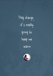
Stance - Anti Flag Change
Issue - The money being spent on the referendums would be better spent on New Zealand’s housing problems
This poster uses the rhetorical devices of irony and juxtaposition to draw attention to an issue in our society. The headline is ironic as it uses language that contrasts the subject of the image. This juxtaposition creates tension and exposes the issue that I am arguing in a way that evokes a sympathetic response in the viewer. I used ihi in my work by applying techniques such as photography and manipulating printed out images with water. These mediums created tangible images and textures that enhance the feelings that occur in the viewer - the wehi. The font I used compliments the atmosphere of the poster as it is quite subtle yet straight to the point. The size and position of the text creates visual flow and hierarchy. The asymmetrical positioning of the image in the bottom left-hand corner makes it feel very submissive, increasing the ethos in the poster and adding to the tone. This poster combines the use of colour, scale, imagery and rhetoric devices to construct a specific voice that elicits a concerned, empathetic response in the audience. This makes the audience re-evaluate their attitudes towards the topic and where their values lie.
Poster 2:
Rationale:
Ihi Wehi: The New Zealand Flag Debate
Stance - Anti Flag Change
Issue - The money being spent on the referendums would be better spent on New Zealand’s housing problems
This poster uses the rhetorical devices of addition/juxtaposition and pun to draw attention to an issue in our society. This addition/juxtaposition of a house shape onto an image of condensation creates a new connotation about housing in New Zealand. It also introduces the issue that I am arguing in a way that makes the viewer re-evaluate the importance of the flag debate. The headline includes a statistic that establishes the subject of the poster and evokes an emotional response in the viewer. The tagline contains a pun that helps challenge the attitudes and values of the audience. I used ihi in my work by applying techniques such as photography and painting on printed out images. These mediums created tangible bold images and contrasting textures that help enhance the feelings that occur in the viewer - the wehi. The word I drew and the grungy typeface I chose compliment the subject of the poster as they have qualities like mould. These textured fonts add to the overall atmosphere of the poster. The different sizes and colours of the text creates visual hierarchy. Overall this poster uses pathos to garner a commiserative response from the audience and make them re-think what is truly more important for New Zealand from an ethical and pitying point of view.
Grids
 |
| Grid: 4x4 This grid focuses most of the content into the centre, making the poster balanced and symmetrical. |
Rationale Guidelines
Approx. 150 words
Title - Ihi Wehi: Topic
Topic - Your stance or position or perspective
Issue relative to your topic
In order for the audience to feel the wehi or evoke a particular response in the audience
(Behaviour, attitudes, perceptions, values, beliefs etc)
Rhetorical Devices
How they have been deliberately chosen and employed/applied (aesthetic/style), technique
Ihi (How have you knowingly used your FADPs etc?)
Voice + Tone of message (conveyed through image and text)
How have you employed the typography in a way that matches your imagery?
Summary - One or two sentences where you justify yourself and your choices
Last Edits
 |
| Photoshopping the painted house into the original photograph of the condensation so that the image isn't pixelated when I print it. |
 |
| I painted the word 'damp' in Photoshop. |
 |
| Erasing bits of the letter forms to make the look more grungy/mouldy. |
 |
| The font was too dark so I tried something lighter. This white makes the text stand out more than the important words so I'm not going to use it. |
 |
| I colour picked this colour for the font from the condensation photograph. It is easy to read and relates to the issue in the poster, but it also doesn't grab attention more than the whiter text. |
 |
| Caroline didn't like this text colour and font. She suggested I look at using a plain sans serif font. |
 |
| I like this hierarchy but the font is to bold. |
 |
| This font is better. I like the weight and the shape of the letterforms. |
Sunday, 16 August 2015
Test Printing Posters For Critique
I printed off my two posters at uni (two A3s that I then stuck together) and put them up on the wall to critique them while they were at full size.
I decided that the poster on the left in the photograph was too grey/purple/green and not blue enough to convey the idea of cold, so I noted that I had to change the colour balance of the photo in Photoshop.
I am unsure about the use of the font for the word 'damp'. I might look at trying to write the word myself.
The quality of the poster on the right isn't very good as the image of the condensation has been printed and re-photographed. I think I should perhaps look at Photoshopping the house shape onto the original photograph so that the final quality of the printed poster is a lot better. This will also make the colours of the condensation image a lot more vibrant.
Saturday, 15 August 2015
More Poster Concept Developments
 |
| Looking at a plain sans serif font. |
 |
| Looking at a handwritten-looking font. I like this one better as it feels more like a voice. |
 |
| 'Paint peeling off wall' background. I like this one better as it looks more grungy and unkempt. |
 |
| 'Wet' background. |
 |
| White text. I prefer white as it complements and contrasts the darkness of the photograph. |
 |
| Black text. |
 |
| Looking at a plain sans serif font. I prefer the other font as it feels like more of a sarcastic voice. |
 |
| I increased the size of the text so that it wasn't fighting for dominance with the image. |
 |
| I found this font on the Massey Server that could work for this poster, but I think I still prefer the other one I have been using. |
Critique:
I asked my friends and family which of my five concepts for my first poster they liked best. It was a very unanimous decision that my fifth concept (the one with the figure in the bottom left corner and the wet background) was the best, so I have decided to use this as my final poster.
 |
| Looking at the headline and tagline. |
 |
| I tried to fit all of text into the shape of the house. I don't know if I like this as it feels too heavy in the centre of the poster. |
 |
| Putting the tagline at the bottom of the poster - this feels much more balanced. |
 |
| I found this font on the Massey Server that could work for this poster, but I think I still prefer the other one I have been using. |
Photoshoot 4
 |
| This is the same technique as above only I photographed it on a flat surface - not stuck on a window. |
New Techniques: Painting on Photos
I had the idea to enhance the Ihi and Wehi of my work by physically manipulating it. In the case of my damp homes poster idea I thought this might allow me to create the shape of a house that is more easily seen than drawing in condensation. The way I thought I could do this is by printing out one of my photographs of condensation and painting a house on it before re-photographing it.
Shae Acopian Detar
Shae Acopian Detar
"LA based artist Shae Acopian Detar has lately focused her aesthetic on film and digital photography with a reputation for her whimsical hand painted photos and antique processing."
http://www.holyholyfashion.com/2012/10/photography-paintings-by-shae-acopian.html
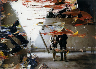
"Gerhard Richter is known for a prolific and stylistically varied exploration of the medium of painting, often incorporating and exploring the visual effects of photography. “I like everything that has no style: dictionaries, photographs, nature, myself and my paintings,” he says. “Because style is violent, and I am not violent.” Richter introduced abstraction into his practice, and he has continued to move freely between figuration and abstraction, producing geometric “Colour Charts”, bold, gestural abstractions, and “Photo Paintings” of anything from nudes, flowers, and cars to landscapes, architecture, and scenes from Nazi history."
Gerhard Richter:
Subscribe to:
Comments (Atom)


