Showing posts with label Ideate. Show all posts
Showing posts with label Ideate. Show all posts
Monday, 17 August 2015
Grids
 |
| Grid: 4x4 This grid focuses most of the content into the centre, making the poster balanced and symmetrical. |
Last Edits
 |
| Photoshopping the painted house into the original photograph of the condensation so that the image isn't pixelated when I print it. |
 |
| I painted the word 'damp' in Photoshop. |
 |
| Erasing bits of the letter forms to make the look more grungy/mouldy. |
 |
| The font was too dark so I tried something lighter. This white makes the text stand out more than the important words so I'm not going to use it. |
 |
| I colour picked this colour for the font from the condensation photograph. It is easy to read and relates to the issue in the poster, but it also doesn't grab attention more than the whiter text. |
 |
| Caroline didn't like this text colour and font. She suggested I look at using a plain sans serif font. |
 |
| I like this hierarchy but the font is to bold. |
 |
| This font is better. I like the weight and the shape of the letterforms. |
Saturday, 15 August 2015
More Poster Concept Developments
 |
| Looking at a plain sans serif font. |
 |
| Looking at a handwritten-looking font. I like this one better as it feels more like a voice. |
 |
| 'Paint peeling off wall' background. I like this one better as it looks more grungy and unkempt. |
 |
| 'Wet' background. |
 |
| White text. I prefer white as it complements and contrasts the darkness of the photograph. |
 |
| Black text. |
 |
| Looking at a plain sans serif font. I prefer the other font as it feels like more of a sarcastic voice. |
 |
| I increased the size of the text so that it wasn't fighting for dominance with the image. |
 |
| I found this font on the Massey Server that could work for this poster, but I think I still prefer the other one I have been using. |
Critique:
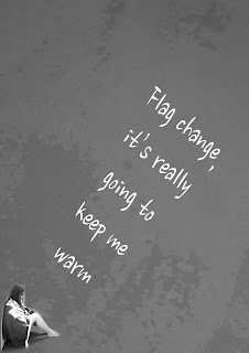
I asked my friends and family which of my five concepts for my first poster they liked best. It was a very unanimous decision that my fifth concept (the one with the figure in the bottom left corner and the wet background) was the best, so I have decided to use this as my final poster.
 |
| Looking at the headline and tagline. |
 |
| I tried to fit all of text into the shape of the house. I don't know if I like this as it feels too heavy in the centre of the poster. |
 |
| Putting the tagline at the bottom of the poster - this feels much more balanced. |
 |
| I found this font on the Massey Server that could work for this poster, but I think I still prefer the other one I have been using. |
Tuesday, 11 August 2015
Monday, 10 August 2015
Sunday, 9 August 2015
Subscribe to:
Posts (Atom)


