 |
| Looking at a plain sans serif font. |
 |
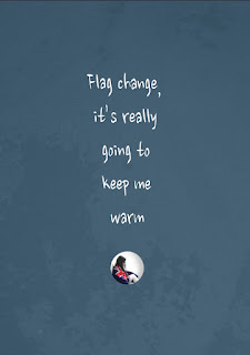
| Looking at a handwritten-looking font. I like this one better as it feels more like a voice. |
 |
| 'Paint peeling off wall' background. I like this one better as it looks more grungy and unkempt. |
 |
| 'Wet' background. |
 |
| White text. I prefer white as it complements and contrasts the darkness of the photograph. |
 |
| Black text. |
 |
| Looking at a plain sans serif font. I prefer the other font as it feels like more of a sarcastic voice. |
 |
| I increased the size of the text so that it wasn't fighting for dominance with the image. |
 |
| I found this font on the Massey Server that could work for this poster, but I think I still prefer the other one I have been using. |
Critique:
I asked my friends and family which of my five concepts for my first poster they liked best. It was a very unanimous decision that my fifth concept (the one with the figure in the bottom left corner and the wet background) was the best, so I have decided to use this as my final poster.
 |
| Looking at the headline and tagline. |
 |
| I tried to fit all of text into the shape of the house. I don't know if I like this as it feels too heavy in the centre of the poster. |
 |
| Putting the tagline at the bottom of the poster - this feels much more balanced. |
 |
| I found this font on the Massey Server that could work for this poster, but I think I still prefer the other one I have been using. |

No comments:
Post a Comment